Debugging Responsive CSS Breakpoints With a Helper
Creating a small CSS helper to highlight active media query breakpoints
Responsive Design · CSS · Tailwind · styled-components · CSS-in-JS
Designing and testing responsive designs can be an involved process. At the minimum it involves the following:
- Having a consistent design system with design tokens for breakpoints to ensure consistency
- Abstracting these breakpoints for use in the layout components such as
<Flex>,<Stack>,<Grid>and others - Checking features and pages built with these layout components are responsive as per the design
- Frequently comparing the implementation with the design
- Comparing again but this time against many screen sizes - probably with a few windows open side by side
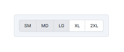
The last two points are what I’m going to focus on here. I’m going to show how to build a small but useful component that indicates the currently active breakpoints. The component has an optional prop that determines which corner of the screen it will be absolutely positioned at. If no prop value is passed then it will be positioned according to the normal flow of the document. You can see two component instances in action - one being inline and the other in the bottom right of this page. Here’s what that looks like - resize your browser to see it in action.
Implementation #
I use Astro and Tailwind for my site, so naturally I built this breakpoint visualisation component with the two of them. Of course, Tailwind isn’t the only way. It could be plain CSS (no thanks!), or it could be one of the many CSS-in-JS/TS solutions out there like styled-components alongside styled-system or perhaps vanilla-extract. My point being, the concept here is pretty universal. I’ll leave it up to the reader to implement it with their preferred framework and styling solution of choice.
There is some slight duplication with the tab styling for two reasons:
- It assumes there might not yet be a design system in place yet where this is used therefore we can’t rely on the existence of a tab component
- I wanted it to be a reference and easy to copy and paste for readers
Hovering over the component reduces the opacity so that it doesn’t mask too much content.
---export interface Props { readonly position?: 'top-left' | 'top-right' | 'bottom-left' | 'bottom-right';};
const { position, offset = 0,} = Astro.props as Props;---<div class:list={[ { 'fixed z-50 m-4': position !== undefined }, { 'top-0 left-0': position === 'top-left' }, { 'top-0 right-0': position === 'top-right' }, { 'bottom-0 left-0': position === 'bottom-left' }, { 'bottom-0 right-0': position === 'bottom-right' }, ]}> <div class="inline-block w-auto p-4 transition-all border border-gray-300 rounded-md hover:opacity-70 bg-slate-100"> <span class="inline-flex text-sm font-medium text-gray-900 rounded-md shadow-sm"> <span class="px-4 py-2 -ml-px bg-white border border-gray-300 rounded-l-md sm:bg-gray-200">SM</span> <span class="px-4 py-2 -ml-px bg-white border border-gray-300 md:bg-gray-200">MD</span> <span class="px-4 py-2 -ml-px bg-white border border-gray-300 lg:bg-gray-200">LG</span> <span class="px-4 py-2 -ml-px bg-white border border-gray-300 xl:bg-gray-200">XL</span> <span class="px-4 py-2 -ml-px bg-white border border-gray-300 rounded-r-md 2xl:bg-gray-200">2XL</span> </span> </div></div>Using the component #
Using the component is straightforward and has a single optional prop for controlling the position. If the prop is not yet it will be displayed inline with the page content. If the prop is set it will assume the position specified.
<BreakpointVisualiser /><BreakpointVisualiser position="top-left" /><BreakpointVisualiser position="top-right" /><BreakpointVisualiser position="bottom-left" /><BreakpointVisualiser position="bottom-right" />