Flexible Design System Components With "as/is" Props
Designing flexible and semantically correct design systems with polymorphic components
Design Systems · TypeScript · CSS-in-JS · Styled-Components · Vue · React · Astro
Background #
Implementing a high-quality design system requires clear goals, common shared values and a consistent approach that strikes a fine balance between flexibility and a constrained design. The components in a design system are built upon these patterns and standards.
While a full discussion on building design systems is beyond the scope of this article, I will be elaborating on a particular feature of most high-quality design systems. This feature is a way of enabling composition of components and flexible but correct semantic usage of HTML elements.
That feature, of course, is “as” or “is” component properties. Different component libraries have ostensibly settled on these two names for the same concept. The idea is surmised by the phrase “Render the given component as the given HTML element”.
This feature is made possible by whichever features of a given component framework allow for dynamic element creation. With this in mind, I will be explaining in a later section how to use the “as” prop to render a component as a different HTML element.
This pattern is so common that the styled-component library has this functionality built in. styled-components calls this concept polymorphic components. Every component created has this “as” prop automatically available to consumers of the component.
Applying the pattern to design systems #
I’ve briefly explained what the so-called “as” prop is for but perhaps so far it isn’t clear why this pattern exists (and why it’s so useful, or how it improves composition). I’ll build an example with a hypothetical design system.
Typography components are a common use case for this pattern. A good component-based design system will have a specific component for rendering text.
<Text> Jackdaws love my big sphinx of quartz.</Text>The same design system will also have components for paragraphs, headings, links, or other textual content. If it did not have these, and only had a single text component, then ultimately the end result (in the case of a design system for the web - HTML) would not be semantically correct.
<Text> This is a heading.</Text>
<Text> This is a paragraph.</Text>Which would render to HTML as the following, assuming the text component uses <p>.
<p> This is a heading.</p>
<p> This is a paragraph.</p>That would indeed be a poor result. What if we needed a <h1> or a <label> or a <span>? This is where the “as” prop comes in - enabling the text component to dynamically render as a specified element.
<Text as="h1"> This is a heading.</Text>
<Text as="p"> This is a paragraph.</Text>Which would render as the following:
<h1> This is a heading.</h1>
<p> This is a paragraph.</p>The text component so far #
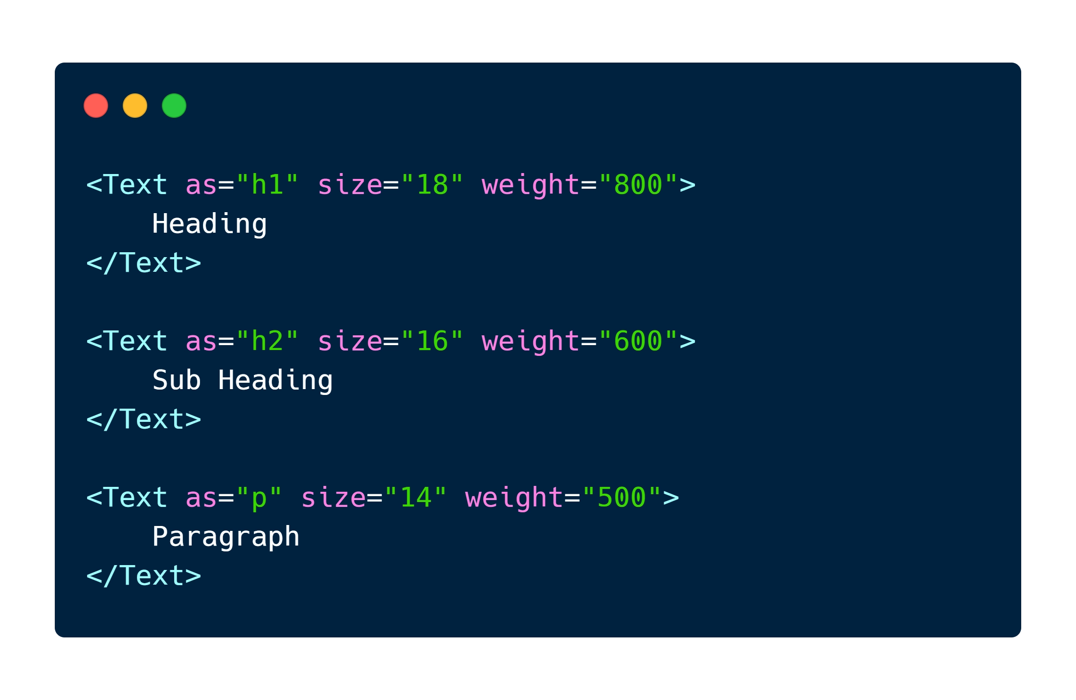
So far we have covered how an “as” prop should work (skip ahead if you want to see how to build it). Assuming that the text component already contains the implementation to support the size and weight props shown in the image at the beginning of the article (don’t forget it needs colour and style props too!) we can now use the component like so:
<Text as="h1" size="18" weight="800"> Heading</Text>
<Text as="p" size="14" weight="600"> Paragraph</Text>As a side note, style props for design system components should be constrained to the available design tokens in the given design system. In practice that means creating types such as:
// Two different examples depending on design system philosophy/approachexport type Colour = 'red' | 'red-light' | 'green' | 'green-light';export type Tone = 'critical' | 'caution' | 'positive' | 'neutral';
export type Size = 1 | 2 | 3 | 4;These types for design tokens are described here for the sake of completeness as they are also another essential feature of design systems, but it is outside the scope are this article.
Flexible but constrained design, as mentioned previously, is a requirement of a high-quality design system. The problem with the implementation of the single text component so far is that although the prop values are constrained to the given TypeScript types any of those values can be used incorrectly and also lead to duplication of code. Clearly, by looking at the code below the problem is evident.
<Text as="label" size="10" weight="300"> Heading</Text>
<Text as="h1" size="20" weight="600"> Paragraph</Text>Composition of typography components #
So, how do we solve this problem? Add more components that compose the text component! Now instead of a single component for text, we have specific types of components. Each of the following components all use the text component while also applying any extra constraints that are appropriate.
<Heading level="1"> I'm a heading</Heading>
<Paragraph size="small"> I'm a paragraph</Paragraph>Where the props could, for example, be defined as:
export type Level = 1 | 2 | 3 | 4;The header component could be implemented like this (React example, but the concept applies universally):
export const Header = ({ level, children }: { level: Level, children?: ReactNode }) => { // Ideally exist in a ES module that contains the design systems tokens. // But are here for article brevity. const levelSizeMap = { '1': 22, '2': 20, '3': 18, '4': 16, };
return ( <Text as={ `h${level}` } size={ levelSizeMap[level] }> { children } </Text> );};With this next step we achieve a few highly desirable design system goals:
- Enforce a set of styling constraints for the typography text component
- Further enforce a set of styling constraints on the other typography components, like header, paragraph, label, that compose the text component
- Prevent mistakes such as making a paragraph bigger than headings by reducing the need for custom styling and removing the need for duplication
The levelSizeMap is just one very simple example of what a design system might dictate. Perhaps paragraphs should apply padding, or maybe labels should have a prop which indicates form validation state. For example:
<Label state="neutral"> First Name</Label>
<Label state="critical"> First Name (required)</Label>Which renders to:
<Text as="label" size="16" weight="500"> First Name</Text>
<Text as="label" size="16" weight="700" colour="red"> First Name (required)</Text>“as” props apply to more than just typography components. For example another fundamental component is the <Box> component.
Implementation details #
The exact method of implementing an “as” prop is dependent on the framework in use. With JSX/TSX based frameworks this can be achieved by creating an inline component. It is important to remember that as per the JSX specification, lowercase element names are considered built in HTML elements. Therefore, components have to be declared with upper camel case.
React & TSX #
const Example = ({ as = 'div', children}: { as?: React.ElementType, children: ReactNode }) => { const Element = as; return ( <Element> { children } </Element> );};Vue & TSX #
export default defineComponent({ name: 'Example',
props: { as: { type: String as PropType<keyof HTMLElementTagNameMap>, required: false, default: 'div', }, },
render () { const Element = this.as;
return ( <Element> {this.$slots.default && this.$slots.default()} </Element> ); },)};Astro & TSX #
---interface Props { as?: keyof HTMLElementTagNameMap;}
const { as: Element = 'div' } = Astro.props as Props;---
<Element> <slot /></Element>Vue & SFC #
<template> <component :is="as"> <slot /> </component></template>
<script lang="ts">import { defineComponent, PropType } from 'vue';
export default defineComponent({ name: 'Example',
props: { as: { type: String as PropType<keyof HTMLElementTagNameMap>, required: false, default: 'div', }, },)};</script>Conclusion #
In this article I briefly discussed some of the essential features that comprise a high-quality design system and then dived into how “as” props allow for correct semantic HTML and demonstrated how to build components on top of this. I wrote several components in a variety of frameworks as a starting point for anyone wishing to add this functionality to their design system. I like to look at existing design systems when building one. I highly recommend this because then you can learn from and look at how the developers solved certain sets of problems you might not have thought of yet.
Further reading and existing literature #
-
Braid Design System - Box component “is” prop
-
styled-components - Polymorphic components/“as” prop
-
Chakra UI - Box component “as” prop
-
Chakra UI - Text component “as” prop
-
Orbit - Box component “as” prop